
This will bring up the Calc Window. We will begin by deleting a few of the icons on the standard tool bar in order to see the chart creation icon.
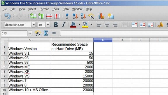
We will convert the following table to a chart:
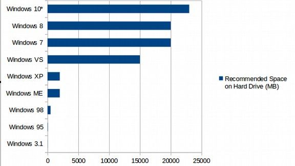
| Windows Version |
Recommended Space on Hard Drive (MB) |
| Windows 3.1 |
15 |
| Windows 95 |
50 |
| Windows 98 |
500 |
| Windows ME |
2,000 |
| Windows XP |
2,000 |
| Windows VS |
15,000 |
| Windows 7 |
20,000 |
| Windows 8 |
20,000 |
| Windows 10 + MS Office |
23,000 |
Copy and paste this simple table into the Calc table and save as “Windows OS File Size Increase over Time”:
Select the data cells, then click on the Three bar “Chart” Icon in the top menu. This creates a chart:
It also brings up a chart editing screen:
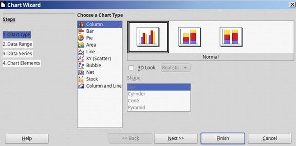
Click on Bar to turn the chart into a bar chart:
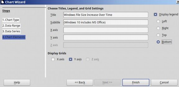
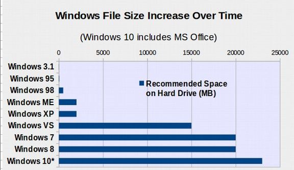
Then click through the four steps. At step 4, add a Title, and move the legend to the bottom of the chart.
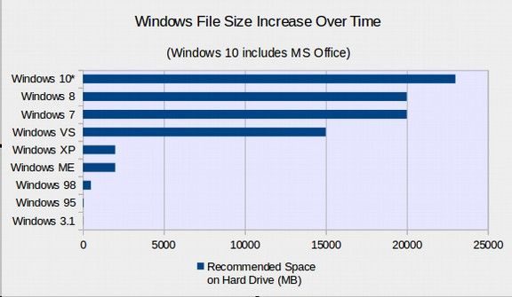
Then click Finish to display the chart. Double click on the chart to edit it. Here is the chart after changing the Chart Area to light gray and the Wall Area to light blue.
Click on Legend, Format Legend. Change the Font Size to 12 Bold and place the Legend inside of the chart. Click on Main Title and click Format. Then change the Font Size to 16 Bold. Click on Subtitle, Format and change the subtitle to 14 Regular.
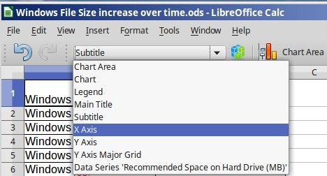
Next click on the X Axis. Then click on Format Axis. Change the font to 12 bold.
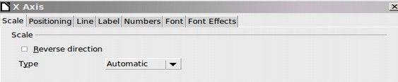
Then click on the Scale Tab and click Reverse Direction.
Then click on the Y Axis Menu Item. Then click Format Axis. Then change the font to 12 Bold.
Next, we want to change the color of the Windows Vista, Windows 7, Windows 8 and Windows 10 bars so they are different from the first four bars. To change the color of an individual bar is tricky. First, you have to double click on the bars to select all of them. Then you have to select an individual bar by clicking on it once.
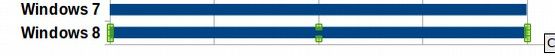
Above we have selected the Windows 8 bar. Note that this brings up some small green bars to indicate that the individual bar has been selected. Then double click on the individual bar to bring up the edit screen:
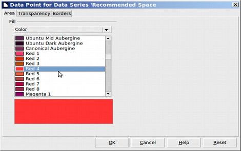
Select the color you want for that bar. Then click OK.
Repeat the steps to change the color of the Windows VS, Windows 7 and Windows 10 bars.
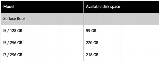
Update: After completing this chart, I discovered that Windows 8 with MS Office was actually about 24GB and Windows 10 with MS Office was actually about 29GB. Here is the link and the table direct from Microsoft: 256 GB HD minus 36GB for Windows 10 (not including 4 more GB for MS Office)
http://www.microsoft.com/surface/en-us/support/storage?os=windows-10
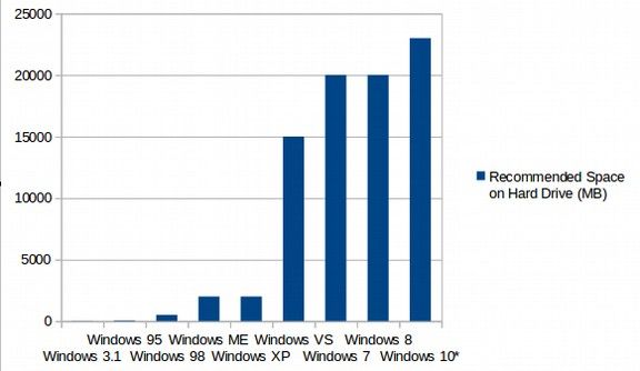
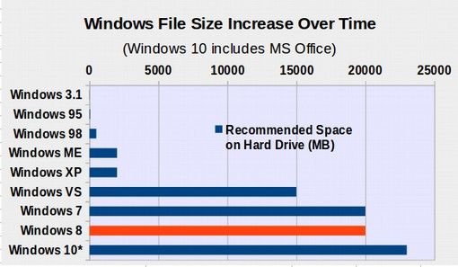
No Problem. I updated the chart in seconds. Below is our finished chart.
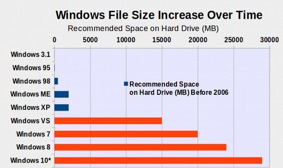
This chart will help Windows users understand why Windows Vista, 7, 8 and 10 are so much slower and less reliable than Windows XP. Folks need to ask themselves why there was such a massive increase in the file size of Window in 2006. In the next section, we will create a slide show using LibreOffice Impress.